Data Chart
Data Chart
Data chart provides the function that displays the external data to a form of the graph such as line, bar, and interval using scripts.
Methods
DataChart is used by reading the DataChart object on the canvas through the canvas object.
The graph is changed according to the setting using data enter methods like addSeriesData, addBarData. Also, it is able to change the style of the graph using setLineColor, or setLineStyle.
Return Type |
Method |
Description |
Add a bar graph data to DataChart. |
||
Add a curve graph data to DataChart. |
||
Add an interval curve graph data to DataChart. |
||
Add a line graph data to DataChart. |
||
Remove the data of DataChart. |
||
connect( eventName, func ) |
Register an event handler to DataChart. When clicked on the graph, it is able to receive the clicked location. |
|
Autoscale the Y-axis scale based on the data displayed on the graph |
||
list[float] |
getGraphData( name ) |
Read the data printed on the graph. |
Enter the name of the graph using the right Y-axis of DataChart. |
||
Set the style of the bar graph to DataChart. |
||
Set the color of the bar graph to DataChart. |
||
Set the space of the bar graph to DataChart. |
||
setBaseLine( yValue ) |
When setting the fill on the line chart, set the bottom standard value of the fill area. |
|
Display the X-axis label with rotating to a given angle to DataChart. |
||
Set the X-axis label to DataChart. |
||
setDataVisible( index , visible ) |
Reveal or hide the graph. |
|
Change the text color of data values. |
||
Set the text size and color of data values displaying on the bar graph. |
||
setEnableDisplayValue( enabled ) |
Set whether data values are displayed on the bar graph. |
|
Display the Y-axis value with rotating to a given angle to DataChart. |
||
Set the color of legend to DataChart. |
||
Set the line color of the line graph to DataChart. |
||
setLineFillColor( name , color ) |
Set the fill color on the line graph. |
|
Set the line style of line graph to DataChart. |
||
Set the line width of line graph to DataChart. |
||
Set a line form of marker to DataChart. |
||
setMarker( name, index, markerColor, labelColor, textSize, pointSize ) |
Set a dot from of marker to DataChart. |
|
setMarkerStyle( name, fontSize, textColor, lineColor, lineWidth, style ) |
Set the style of marker to DataChart. |
|
Display the Y-axis value with rotating to a given angle to DataChart. |
||
Set the title to DataChart. |
||
Set the range and space of X-axis to DataChart. |
||
Set the range and space of Y-axis to DataChart. |
||
Set the range and space of the right Y-axis to DataChart. |
||
Create the zone(area) to DataChart. |
||
setZoneStyle( name, zoneColor, lineColor, lineWidth, style ) |
Set the style of zone(area) to DataChart. |
|
Set the zoom to DataChart. |
||
Reveal or hide the legend to DataChart. |
The way of obtaining DataChart objects is using canvas objects. Enter the name of DataChart to canvas.getObject() method, and it obtains DataChart objects.
chart = canvas.getObject('DataChart_0') #Obtain the DataChart widget.
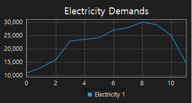
setTitle is a function that sets the name of DataChart. ㆍ title: Enter the name of DataChart. Example)
chart = canvas.getObject('DataChart_0') #Obtain the data chart widget. chart.setTitle('Electricity Demands') #Set the name of DataChart as ' '. |
|
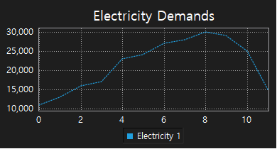
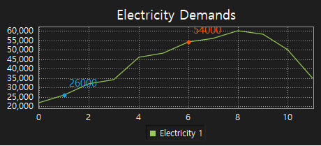
addSeriesData adds the data of the line graph to DataChart. ㆍ name: Enter the name of the line graph data. The name is displayed on legend, each graph must have a different name. ㆍ value: Enter the data of the line graph. Set the list of data which is [index, value]. ※ Notice ㆍ The data list is set in order of index and displayed. ㆍ When writing the data list, it should be set in order of the X-axis index. Example) Use the dual number
chart = canvas.getObject('DataChart_0') #Obtain the data chart widget. chart.setTitle('Electricity demands') #Set the name of DataChart as ''. kwData = list() kwData = ([0, 11000],[1, 13000],[2, 16000],[3, 17000],[4, 23000],[5, 24000], [6, 27000],[7, 28000],[8, 30000],[9, 29000],[10, 25000],[11, 15000] ) chart.addSeriesData('Electricity 1', kwData) #Represent the data to the data chart as a line graph, and set the name as 'Electricity 1'. |
|
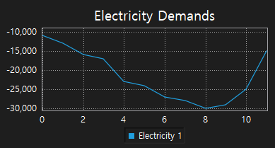
Example) Use the negative number.
chart = canvas.getObject('DataChart_0') #Obtain the data chart widget. chart.setTitle('Electricity Demands') #Set the name of DataChart as ''. kwData = list() kwData = ([0, -11000],[1, -13000],[2, -16000],[3, -17000],[4, -23000],[5, -24000], [6, -27000],[7, -28000],[8, -30000],[9, -29000],[10, -25000],[11, -15000] ) chart.addSeriesData('Electricity 1', kwData) #Represent the data to the data chart as a line graph, and set the name as 'Electricity 1'. |
|
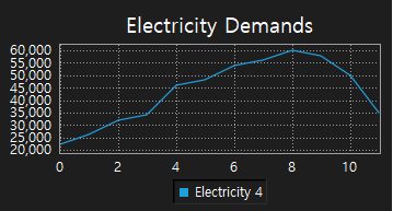
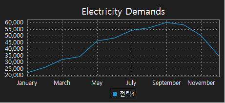
addCurveData adds the data of the curve graph to DataChart. ㆍ name: Enter the name of the curve graph. ㆍ value: Enter the data of the curve graph. Value must be set in order of the X-axis. ※ Notice ㆍ The data list is set in order of the X-axis index and displayed. ㆍ When writing the data list, the index of the first data is 0, and it increments by 1 for the next data. Example)
chart = canvas.getObject('DataChart_0') #Obtain the data chart widget. kwData = list() kwData = (22000, 26000, 32000, 34000, 46000, 48000, 54000, 56000, 60000, 58000, 50000, 35000) chart.addCurveData('Electricity 4', kwData) #Represent the data to the data chart as a line graph, and set the name as 'Electricity 4'. |
|
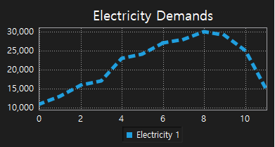
setLineStyle sets the line style of the line graph to DataChart. ㆍ name: Enter the name of the line graph. ㆍ style: Set the style of the line graph. Line types are defined as SolidLine, DashLine, DotLine, DashDotLine, DashDotDotLine on DataSeriseChartItem . - SolidLine : Draw a solid line. - DashLine : Draw a dash line. - DotLine : Draw a dot line. - DashDotLine : Draw a dash dot line. - DashDotDotLine : Draw a dash dot dot line. Example)
chart = canvas.getObject('DataChart_0') #Obtain the data chart widget. chart.setTitle('Electricity Demands') #Set the name of the data chart as 'Electricity Demands'. kwData = list() kwData = ([0, 11000],[1, 13000],[2, 16000],[3, 17000],[4, 23000],[5, 24000], [6, 27000],[7, 28000],[8, 30000],[9, 29000],[10, 25000],[11, 15000] ) chart.addSeriesData('Electricity 1', kwData) #Set data to the data chart as a line graph, and set its name as 'Electricity 1'. chart.setLineStyle('Electricity 1', DataSeriseChartItem.DotLine) #Set the line style of 'Electricity 1' as a dot line. |
|
setLineWidth sets the line width of the line graph to DataChart. ㆍ name: Enter the name of line graphs. ㆍ width: Set the line width of the line graph. Line width is an Integer number bigger than 0. Example)
chart = canvas.getObject('DataChart_0') #Obtain the DataChart widget. kwData = list() kwData = ([0, 11000],[1, 13000],[2, 16000],[3, 17000],[4, 23000],[5, 24000], [6, 27000],[7, 28000],[8, 30000],[9, 29000],[10, 25000],[11, 15000] ) chart.addSeriesData('Electricity 1', kwData) #Display data on the DataChart as a line graph and set its name as 'Electricity 1'. chart.setLineStyle('Electricity 1', DataSeriseChartItem.DotLine) #Set the line style of 'Electricity 1' as a dot line. chart.setLineWidth('Electricity 1', 5) #Set the line width of 'Electricity 1' as 5. |
|
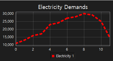
setLineColor sets the line color of the line graph to DataChart. ㆍ name: Enter the name of line graphs. ㆍ color: Set the line color of the line graph. Line color is set by using the QColor object. QColor object has to be set RGB color values and transparency values. Each value is an Integer number 0 to 255. QColor object is used as follows. ㆍ Function QColor(red,green,blue,transparency) ㆍ Use example - Red: QColor(255,0,0,255) - Green: QColor(0,255,0,128) - Blue: QColor(0,0,255,255) |
Example)
chart = canvas.getObject('DataChart_0') #Obtain the DataChart widget. chart.setTitle('Electricity Demands') #Set the name of DataChart as 'Electricity Demands'. kwData = list() kwData = ([0, 11000],[1, 13000],[2, 16000],[3, 17000],[4, 23000],[5, 24000], [6, 27000],[7, 28000],[8, 30000],[9, 29000],[10, 25000],[11, 15000] ) chart.addSeriesData('Electricity 1', kwData) #Display data on the DataChart as a line graph, and set its name as 'Electricity 1'. chart.setLineWidth('Electricity 1', 5) #Set the line width of 'Electricity 1' as 5. chart.setLineStyle('Electricity 1', DataSeriseChartItem.DotLine) #'Set the line style of 'Electricity 1' as a dot line. chart.setLineColor('Electricity 1', QColor(255,0,0,255)) #Set the line color of 'Electricity 1' as QColor(255,0,0,255).
|
|
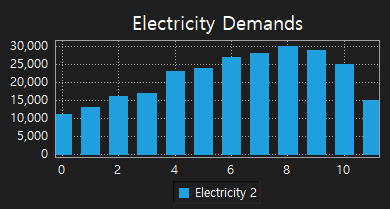
addBarData adds the data of bar graph to DataChart. ㆍ name: Enter the name of the bar graph. ㆍ value: Enter the data of the bar graph. Value is set in order of the X-axis. ※ Notice ㆍ The data list is set in order of the X-axis index and displayed. ㆍ When writing the data list, the index of the first data is 0, and the next index increments by 1. Example)
chart = canvas.getObject('DataChart_0') #Obtain the DataChart widget. chart.setTitle('Electricity Demands') #Set the name as 'Electricity Demands'. kwData = list() kwData = (11000, 13000, 16000, 17000, 23000, 24000, 27000, 28000, 30000, 29000, 25000, 15000) chart.addBarData('Electricity 2', kwData) #Display data on the DataChart as a bar graph, and set its name as 'Electricity 2'. |
|
Example)
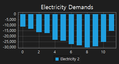
chart = canvas.getObject('DataChart_0') #Obtain the DataChart widget. chart.setTitle('Electricity Demands') #Set the name as 'Electricity Demands'. kwData = list() kwData = (-11000, -13000, -16000, -17000, -23000, -24000, -27000, -28000, -30000, -29000, -25000, -15000) chart.addBarData('Electricity 2', kwData) #Display data on the DataChart as a bar graph, and set its name as 'Electricity 2'. |
|
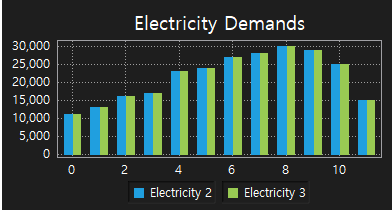
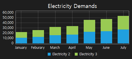
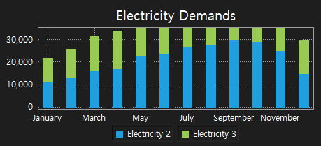
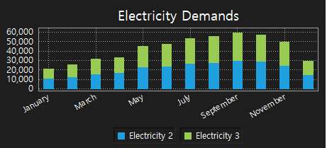
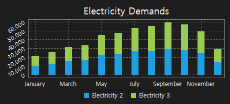
setBarChartStyle sets the bar graph style to DataChart. ㆍ style: Set the style of bar graphs. ㆍ Style type - DataSeriseChartItem.Group : Group - DataSeriseChartItem.Stacked : Stacked |
Example) Set to Group style
chart = canvas.getObject('DataChart_0') #Obtain the DataChart widget. chart.setTitle('Electricity Demands') #Set the name as 'Electricity Demands'. kwData = list() kwData = (11000, 13000, 16000, 17000, 23000, 24000, 27000, 28000, 30000, 29000, 25000, 15000) chart.addBarData('Electricity 2', kwData) #Display data on the DataChart as a bar graph, and set its name as 'Electricity 2'. chart.addBarData('Electricity 3', kwData) #Display data on the DataChart as a bar graph, and set its name as 'Electricity 3'. chart.setBarChartStyle(DataSeriseChartItem.Group) #Set the style of the bar graph as Group.
|
|
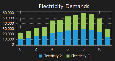
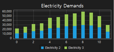
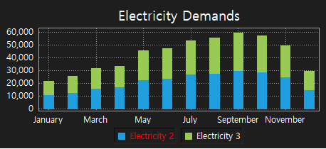
Example) Set to Stacked style
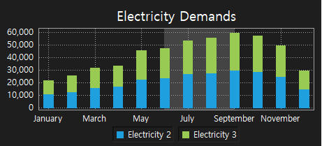
chart = canvas.getObject('DataChart_0') #Obtain the DataChart widget. chart.setTitle('Electricity Demands') #Set the name as 'Electricity Demands'. kwData = list() kwData = (11000, 13000, 16000, 17000, 23000, 24000, 27000, 28000, 30000, 29000, 25000, 15000) chart.addBarData('Electricity 2', kwData) #Display data on the DataChart as a bar graph, and set its name as 'Electricity 2'. chart.addBarData('Electricity 3', kwData) #Display data on the DataChart as a bar graph, and set its name as 'Electricity 3'. chart.setBarChartStyle(DataSeriseChartItem.Stacked) #Set the style of the bar graph as Stacked.
|
|
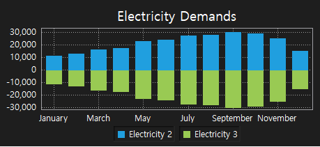
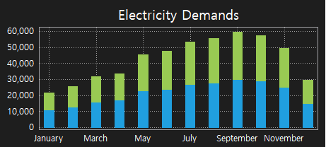
Example) Set to Stacked style
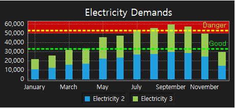
chart = canvas.getObject('DataChart_0') #Obtain the DataChart widget. chart.setTitle('Electricity Demands') #.Set the name as 'Electricity Demands'. kwData = list() kwData = (11000, 13000, 16000, 17000, 23000, 24000, 27000, 28000, 30000, 29000, 25000, 15000) kwData2 = list() kwData2 = (-11000, -13000, -16000, -17000, -23000, -24000, -27000, -28000, -30000, -29000, -25000, -15000) chart.addBarData('Electricity 2', kwData) #Display data on the DataChart as a bar graph, and set its name as 'Electricity 2'. chart.addBarData('Electricity 3', kwData2) #Display data on the DataChart as a bar graph, and set its name as 'Electricity 3'. chart.setBarChartStyle(DataSeriseChartItem.Stacked) #Set the style of the bar graph as Stacked. names = list() names = ('January, Feburary, March, April, May, June, July, August, September, October, November, December') chart.setCategories(names) #Set the X-axis name of the DataChart as names.se |
|
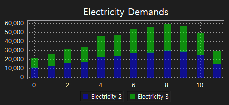
setBarSpacing sets the bar graph space to DataChart. ㆍ name: Enter the name of the bar graph. ㆍ width: Set the space between bar graphs. Value is an Integer number. |
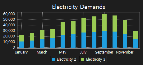
Example) Set to Stacked style
chart = canvas.getObject('DataChart_0') #Obtain the DataChart widget. chart.setTitle('Electricity Demands') #Set the name as 'Electricity Demands'. kwData = list() kwData = (11000, 13000, 16000, 17000, 23000, 24000, 27000, 28000, 30000, 29000, 25000, 15000) chart.addBarData('Electricity 2', kwData) #Display data on the DataChart as a bar graph, and set its name as 'Electricity 2'. chart.addBarData('Electricity 3', kwData) #Display data on the DataChart as a bar graph, and set its name as 'Electricity 3'. chart.setBarChartStyle(DataSeriseChartItem.Stacked) #Set the style of the bar graph as Stacked. chart.setBarSpacing(20) #Set the space of the bar graph as 20.
|
|
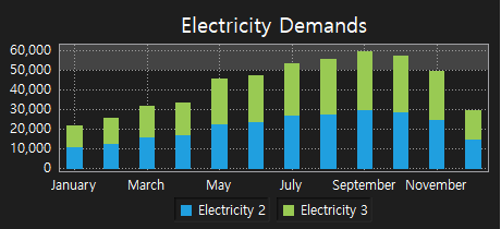
setBarColor sets the color of the bar graph to DataChart. ㆍ name: Enter the name of the bar graph. ㆍ color: Set the color of the bar graph. Color is set by using the QColor object. |
QColor object has to be set RGB color values and transparency values. Each value is an Integer number 0 to 255. QColor object is used as follows. ㆍ Function QColor(red,green,blue,transparency) ㆍ Use example - Red: QColor(255,0,0,255) - Green: QColor(0,255,0,128) - Blue: QColor(0,0,255,255) |
Example)
chart = canvas.getObject('DataChart_0') #Obtain the DataChart widget. chart.setTitle('Electricity Demands') #Set the name as 'Electricity Demands'. kwData = list() kwData = (11000, 13000, 16000, 17000, 23000, 24000, 27000, 28000, 30000, 29000, 25000, 15000) chart.addBarData('Electricity 2', kwData) #Display data on the DataChart as a bar graph, and set its name as 'Electricity 2'. chart.addBarData('Electricity 3', kwData) #Display data on the DataChart as a bar graph, and set its name as 'Electricity 3'. chart.setBarChartStyle(DataSeriseChartItem.Stacked) #Set the style of the bar graph as Stacked. chart.setBarSpacing(20) #Set the space of the bar graph as 20. chart.setBarColor('Electricity 2', QColor(0,0,255,128)) #Set the color of the bar graph as QColor(0,0,255,128). chart.setBarColor('Electricity 3', QColor(0,255,0,128)) #Set the color of the bar graph as QColor(0,255,0,128). |
|
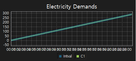
addIntervalCurve adds the data of the interval curve graph to DataChart. ㆍ name : Enter the name of the interval curve graph. ㆍ value : Enter the data of the interval curve graph. Set the list of data which is [min, max]. ※ Notice ㆍ The data list is set in order of the X-axis index and displayed. ㆍ When writing data list, the index of the first data is 0, and the next index increments by 1. Example)
chart = canvas.getObject('DataChart_1') chart.clear() hour = 0 names=list(); for h in range(0,24): for m in range(0,12): names.append('%02d:%02d' %(h,m*5)); hour=hour+1 chart.setCategories(names) chart.setXRange(0,12*24,12)
d1 = list() d2 = list() d3 = list() value =0; for v in range(0,24): for m in range(0,12): d1.append(value) value=value+1 value = 0; for v in range(0,14): for m in range(0,12): d2.append(value) value=value+0.5 value = 0; for v in range(0,24): for m in range(0,12): #min,max minmax=[value-10,value+10] d3.append(minmax) value=value+1 chart.addIntervalCurve('Intval',d3) chart.addCurveData('C1',d1) |
|
setCategories sets the X-axis label to DataChart. ㆍ names: Set the list of labels to display on the X-axis. Example)
chart = canvas.getObject('DataChart_0') #Obtain the DataChart widget. kwData = list() kwData = (22000, 26000, 32000, 34000, 46000, 48000, 54000, 56000, 60000, 58000, 50000, 35000) chart.addCurveData('Electricity 4', kwData) #Display data on the DataChart as a curve graph, and set its name 'Electricity 4'. names = list() names = ('January, Feburary, March, April, May, June, July, August, September, October, November, December') chart.setCategories(names) #Set the X-axis name of the DataChart as names. |
|
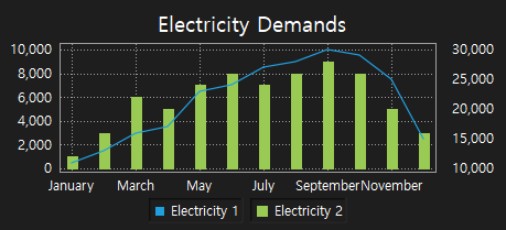
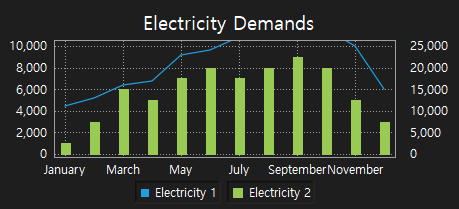
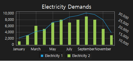
moveToY2Scale enters the name of the graph which is using the right Y-axis. ㆍ name: Enter the name of the graph using the right Y-axis. It follows the right Y-axis. Example)
chart = canvas.getObject('DataChart_0') #Obtain the DataChart widget. chart.setTitle('Electricity Demands') #Set the name as 'Electricity Demands'. names = list() names = ('January, Feburary, March, April, May, June, July, August, September, October, November, December') chart.setCategories(names) #Set the X-axis name as names. kwData = list() kwData = ([0, 11000],[1, 13000],[2, 16000],[3, 17000],[4, 23000],[5, 24000], [6, 27000], [7, 28000],[8, 30000],[9, 29000],[10, 25000],[11, 15000]) chart.addSeriesData('Electricity 1', kwData) #Display data on the DataChart as a line graph, and set its name as 'Electricity 1'. kwData1 = (1000, 3000, 6000, 5000, 7000, 8000, 7000, 8000, 9000, 8000, 5000, 3000) chart.addBarData('Electricity 2', kwData1) #Display data on the DataChart as a bar graph, and set its name as 'Electricity 2'. chart.moveToY2Scale('Electricity 1') #'Electricity 1' follows the right Y-axis. |
|
ㆍ 'Electricity 1' follows the right Y-axis. ㆍ 'Electricity 2' follows the left Y-axis. |
setBottomLabelRotate sets the X-axis label of DataChart to rotate to a given angle. ㆍ angle: Enter an angle to rotate the label of the X-axis. ㆍ The angle could be 0~360 degrees, or -1~-360 degrees. Example)
chart = canvas.getObject('DataChart_0') #Obtain the DataChart widget. chart.setTitle('Electricity Demands') #Set the name as 'Electricity Demands' kwData = list() kwData = (11000, 13000, 16000, 17000, 23000, 24000, 27000, 28000, 30000, 29000, 25000, 15000) chart.addBarData('Electricity 2', kwData) #Display data on the DataChart as a bar graph, and set its name as 'Electricity 2'. chart.addBarData('Electricity 3', kwData) #Display data on the DataChart as a bar graph, and set its name as 'Electricity 2'. chart.setBarChartStyle(DataSeriseChartItem.Stacked) #Set the style of the bar graph as Stacked. chart.setBarSpacing(20) #Set the space of the bar graph as 20. names = list() names = ('January, Feburary, March, April, May, June, July, August, September, October, November, December') chart.setCategories(names) #Set the X-axis label as names. chart.setBottomLabelRotate(-30) #Display the X-axis label rotating to -30. |
|
setLeftLabelRotate sets the Y-axis label of DataChart to rotate to a given angle. ㆍ angle: Enter an angle to rotate the label of the Y-axis. ㆍ The angle could be 0~360 degrees or -0~-360 degrees. Example)
chart = canvas.getObject('DataChart_0') #Obtain the DataChart widget. chart.setTitle('Electricity Demands') #Set the name as 'Electricity Demands'. kwData = list() kwData = (11000, 13000, 16000, 17000, 23000, 24000, 27000, 28000, 30000, 29000, 25000, 15000) chart.addBarData('Electricity 2', kwData) #Display data on the DataChart as a bar graph, and set its name as 'Electricity 2'. chart.addBarData('Electricity 3', kwData) #Display data on the DataChart as a bar graph, and set its name as 'Electricity 3'. chart.setBarChartStyle(DataSeriseChartItem.Stacked) #Set the style of the bar graph as Stacked. chart.setBarSpacing(20) #Set the space of the bar graph as 20. names = list() names = ('January, Feburary, March, April, May, June, July, August, September, October, November, December') chart.setCategories(names) #Set the Y-axis label as names. chart.setLeftLabelRotate (-30) #Display the Y-axis label rotating to -30. |
|
setRightLabelRotate sets the sub-Y-axis label of the DataChart to rotate to a given angle. ㆍ angle: Enter an angle to rotate the label of the Y-axis. ㆍ The angle could be 0~360 degrees, or -0~-360 degrees, Example)
chart = canvas.getObject('DataChart_0') #Obtain the DataChart widget. chart.setTitle('Electricity Demands') #Set the name as 'Electricity Demands'. names = list() names = ('January, Feburary, March, April, May, June, July, August, September, October, November, December') chart.setCategories(names) #Set the X-axis label as names. kwData = list() kwData = ([0, 11000],[1, 13000],[2, 16000],[3, 17000],[4, 23000],[5, 24000], [6, 27000], [7, 28000],[8, 30000],[9, 29000],[10, 25000],[11, 15000]) chart.addSeriesData('Electricity 1', kwData) #Display data on the DataChart as a line graph, and set its name as 'Electricity 1' kwData1 = (1000, 3000, 6000, 5000, 7000, 8000, 7000, 8000, 9000, 8000, 5000, 3000) chart.addBarData('Electricity 2', kwData1) #Display data on the DataChart as a bar graph, and set its name as 'Electricity 2' chart.moveToY2Scale('Electricity 1') #'Electricity 1' follows the right Y-axis. chart.setRightLabelRotate (30) #Display the sub-Y-axis label rotating to -30. |
|
setLegendTextColor sets the text color of legends in DataChart. ㆍ name: Enter the name of the graph to change ㆍ color: Set the color of legends. It uses the QColor object. QColor object has to be set RGB color values and transparency values. QColor object is used as follows. ㆍ Function QColor(red,green,blue,transparency) ㆍ Use example - Red: QColor(255,0,0,255) - Green: QColor(0,255,0,128) - Blue: QColor(0,0,255,255) Example)
chart = canvas.getObject('DataChart_0') #Obtain the DataChart widget. chart.setTitle('Electricity Demands') #Set the name as 'Electricity Demands'. kwData = list() kwData = (11000, 13000, 16000, 17000, 23000, 24000, 27000, 28000, 30000, 29000, 25000, 15000) chart.addBarData('Electricity 2', kwData) #Display data on the DataChart as a bar graph, and set its name as 'Electricity 2'. chart.addBarData('Electricity 3', kwData) #Display data on the DataChart as a bar graph, and set its name as 'Electricity 3'. chart.setBarChartStyle(DataSeriseChartItem.Stacked) #Set the style of the bar graph as Stacked. chart.setBarSpacing(20) #Set the space of the bar graph as 20. names = list() names = ('January, Feburary, March, April, May, June, July, August, September, October, November, December') chart.setCategories(names) #Set the X-axis label as names. chart.setLegendTextColor('Electricity 2', QColor(255,0,0,255)) #'Set the color of the legend as QColor(255,0,0,255). |
|
showLegend reveals or hides the legend of DataChart. ㆍ show: To reveal the legend, enter 1. To hide the legend, enter 0. Example) To hide the legend
chart = canvas.getObject('DataChart_0') #Obtain the DataChart widget. chart.setTitle('Electricity Demands') #Set the name as 'Electricity Demands'. kwData = list() kwData = (11000, 13000, 16000, 17000, 23000, 24000, 27000, 28000, 30000, 29000, 25000, 15000) chart.addBarData('Electricity 2', kwData) #Display data on the DataChart as a bar graph, and set its name as 'Electricity 2'. chart.addBarData('Electricity 3', kwData) #Display data on the DataChart as a bar graph, and set its name as 'Electricity 3'. chart.setBarChartStyle(DataSeriseChartItem.Stacked) #Set the style of the bar graph as Stacked. chart.setBarSpacing(20) #Set the space of the bar graph as 20. names = list() names = ('January, Feburary, March, April, May, June, July, August, September, October, November, December') chart.setCategories(names) #Set the X-axis label as names. chart.showLegend(0) #Hide the legend. |
|
Example) To reveal the legend
chart = canvas.getObject('DataChart_0') #Obtain the DataChart widget. chart.setTitle('Electricity Demands') #Set the name as 'Electricity Demands'. kwData = list() kwData = (11000, 13000, 16000, 17000, 23000, 24000, 27000, 28000, 30000, 29000, 25000, 15000) chart.addBarData('Electricity 2', kwData) #Display data on the DataChart as a bar graph, and set its name as 'Electricity 2'. chart.addBarData('Electricity 3', kwData) #Display data on the DataChart as a bar graph, and set its name as 'Electricity 3'. chart.setBarChartStyle(DataSeriseChartItem.Stacked) #Set the style of the bar graph as Stacked. chart.setBarSpacing(20) #Set the space of the bar graph as 20. names = list() names = ('January, Feburary, March, April, May, June, July, August, September, October, November, December') chart.setCategories(names) #Set the X-axis label as names. chart.showLegend(0) #Reveal the legend. |
|
setZoomMode sets a zoom to DataChart as Horizontal and Vertical. ㆍ Horizontal is applied to the X-axis, Vertical is applied to the Y-axis. ㆍ mode: Enter Horizontal or Vertical. Example) Apply the Horizontal zoom mode
chart = canvas.getObject('DataChart_0') #Obtain the DataChart widget. chart.setZoomMode(DataSeriseChartItem.Horizontal) #Set the zoom as a horizontal mode. |
Example) Apply the Vertical zoom mode
chart = canvas.getObject('DataChart_0') #Obtain the DataChart widget, chart.setZoomMode(DataSeriseChartItem.Vertical) #Set the zoom as a vertical mode. |
clear removes the data on DataChart. Example)
chart = canvas.getObject('DataChart_0') #Obtain the DataChart widget. chart.clear() #Remove the data on the DataChart. |
Reveal or hide the graph data.
Example)
chart = canvas.getObject('DataChart_0') #Obtain the DataChart widget. chart.setDataVisible(0, 1) #Reveal the 0th data. chart.setDataVisible(0, 0) #Hide the 0th data. |
cheriesData('Electricity 1', kwData)
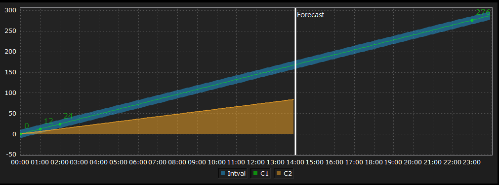
It is used to fill the color on the line graph. Example)
chart = canvas.getObject('DataChart_0') #Obtain the DataChart widget. chart.setLineFillColor('C2', QColor(246,166,37,127)) #Set the fill color as QColor(246,166,37,127).
|
Result) |
|
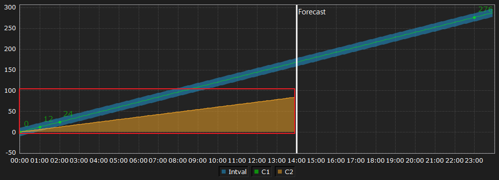
chart.addSeriesData('Electricity 1', kwData)
Set the fill baseline when filling the color on the line graph. The default value is 0. Example)
chart = canvas.getObject('DataChart_0') #Obtain the DataChart widget. chart.setLineFillColor('C2', QColor(246,166,37,127)) #Set the fill color as QColor(246,166,37,127). chart.setBaseLine(-50) #Set the baseline as -50.
|
Result) |
|
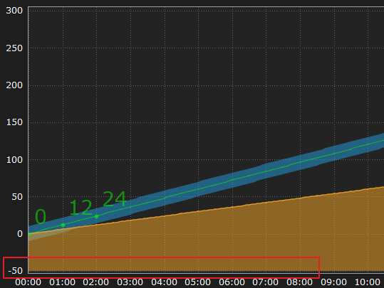
chart.addSeriesData('Electricity 1', kwData)
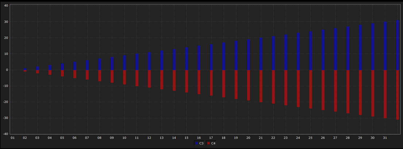
It is used to change the text color of the graph as below. Example)
chart = canvas.getObject('DataChart_0') #Obtain the DataChart widget. chart.setDisplayTextColor('C1', QColor(255,0,0)) #Set the text color as QColor(255,0,0).
|
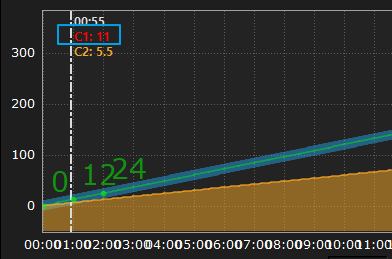
chart.addSeriesData('Electricity 1', kwData)
Read the data printed on the graph. Example)
chart = canvas.getObject('DataChart_0') #Obtain the DataChart widget. print chart.getGraphData('A') #Obtain the 'A' data as a list. |
Output)
(6.099999999976717, 5.400000000023283, 6.199999999982538, 6.0, 5.899999999994179, 5.7000000000116415, 5.999999999970896, 5.800000000017462, 5.899999999994179, 9.500000000029104, 9.799999999988358, 9.899999999965075, 10.800000000046566, 10.39999999999418, 10.699999999982538, 10.300000000046566, 9.699999999982538, 9.799999999988358, 6.0, 6.0, 5.999999999970896, 6.100000000005821, 5.600000000034925, 6.099999999976717 ) |
Set whether the data displays on the bar graph. ㆍ enabled: Enter 0 or 1. - When entering 1, the data value is displayed on the bar graph. - When entering 0, the data value is not displayed on the bar graph. Example)
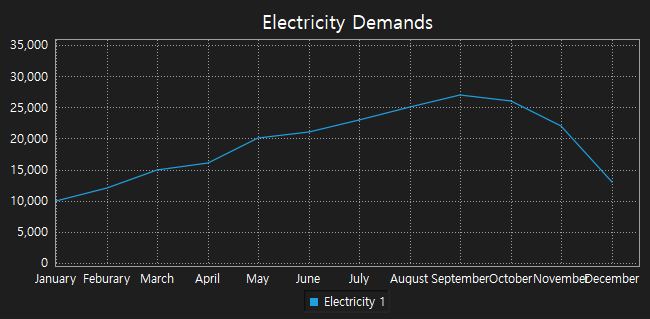
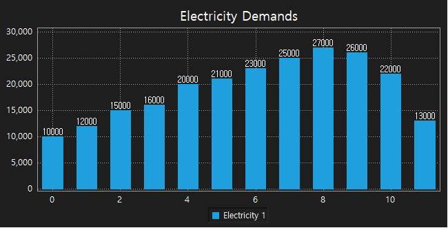
chart = canvas.getObject('DataChart_0') #Obtain the DataChart widget. chart.setTitle('Electricity Demands') #Set the name as 'Electricity Demands'. kwData = list() kwData = (10000, 12000, 15000, 16000, 20000, 21000, 23000, 25000, 27000, 26000, 22000, 13000) chart.addBarData('Electricity 1', kwData) #Display data on the DataChart as a bar graph, and set its name as 'Electricity 1'. chart.setEnableDisplayValue(1) #Set the data displaying on the bar graph. Example)
chart = canvas.getObject('DataChart_0') #Obtain the DataChart widget. chart.setTitle('Electricity Demands') #Set the name as 'Electricity Demands'. kwData = list() kwData = (10000, 12000, 15000, 16000, 20000, 21000, 23000, 25000, 27000, 26000, 22000, 13000) chart.addBarData('Electricity 1', kwData) #Display data on the DataChart as a bar graph, and set its name as 'Electricity 1'. chart.setEnableDisplayValue(0) #Set the data invisible. |
|

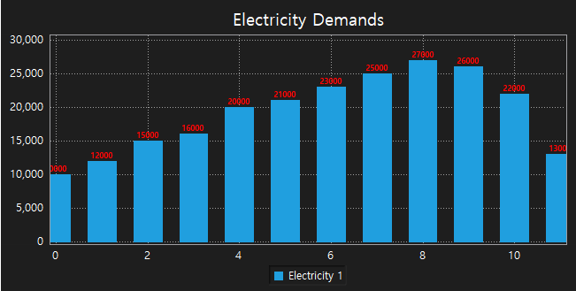
Set the text size and color of data values displayed on the bar graph. ㆍ textSize: Enter the text size. ㆍ color: Enter the text color using the QColor object. QColor object has to be set RGB color values and transparency values. Each value is an Integer value between 0 to 255. QColor object is used as follows. ㆍ Function QColor(red,green,blue,transparency) ㆍ Use example - Red: QColor(255,0,0,255) - Green: QColor(0,255,0,128) - Blue: QColor(0,0,255,255) Example)
chart = canvas.getObject('DataChart_0') #Obtain the DataChart widget. chart.setTitle('Electricity Demands') #Set the name as 'Electricity Demands'. kwData = list() kwData = (10000, 12000, 15000, 16000, 20000, 21000, 23000, 25000, 27000, 26000, 22000, 13000) chart.addBarData('Electricity 1', kwData) #Display data on the DataChart as a bar graph, and set its name as 'Electricity 1'. chart.setEnableDisplayValue(1) #Set the data displaying on the bar graph. chart.setDisplayValueStyle(7,QColor(255,0,0,255)) #Set the color as red, and the text size as 7. |
|
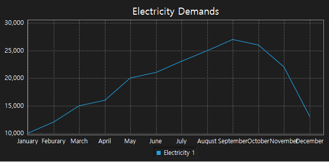
Auto-scale the scale of Y-axis based on the data displayed on the graph. Example) Apply fitDataScale
chart = canvas.getObject('DataChart_0') #Obtain the DataChart widget. chart.setTitle('Electricity Demands') #Set the name as ' Electricity Demands'. kwData = list() kwData = (10000, 12000, 15000, 16000, 20000, 21000, 23000, 25000, 27000, 26000, 22000, 13000) chart.addCurveData('Electricity 1', kwData) #Display data on the DataChart as a curve graph, and set its name as 'Electricity 1'. names = list() names = ('January, Feburary, March, April, May, June, July, August, September, October, November, December') chart.setCategories(names) #Set the X-axis label as names. chart.setXRange(0,11,1) #Display the 0th item to 11th item of names on the X-axis, and the space is 1. chart.fitDataScale() #Auto-scale the Y-axis based on the displayed data. |
||
|